Loading...
Loading...
Loading...
Loading...
Loading...
Loading...
Loading...
Loading...
Loading...
Loading...
Loading...
Loading...
Loading...
Loading...
Loading...
Loading...
Loading...
Loading...
Loading...
Loading...
Loading...
Loading...
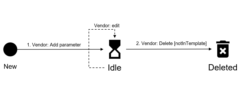
The following diagram shows the possible states a parameter may have in the Marketplace Platform and the transition between these states:
Idle
The parameter has been created as part of the product definition. It can be used to collect data as part of the order, fulfillment, or configuration phases.
Deleted
Create a product parameter.
The parameter no longer exists. It's no longer part of the product definition and can't be used to collect data as part of the order, fulfillment, or configuration phases.
Get a list of parameters for a product.
Delete a product parameter definition.
Get a product parameter definition.
The Parameter object contains the following properties:
id
string
(Read-only) Platform-generated ID of the parameter.
Update a product parameter definition.
Represents the parameter constraints object.
The “Single-line text” parameter is the usual input field supported with the standard constraints which are optional by default. The value type is string.
The heading parameter is useful when a textual content separator is required, such as a heading in a form that distinguishes different groups of form inputs.
scope
string
(Read-only) The context in which the parameter will be used.
phase
string
(Read-only) The process during which the parameter will be used.
context
string
(Read-only) Used only in the Order scope and during the Order phase. If the scope is not set to Order, the context value is assigned as None. Allowed values are:
Change
Configuration
Purchase
Termination
None
type
string
(Read-only) Indicates the UI component that will be used to capture information.
options
object
Are specific to the selected field type and allow customization of the UI component. One of the following option‑object types:
AddressOptions
CheckboxOptions
SingleLineTextOptions
MultiLineTextOptions
ChoiceOptions
ContactOptions
SubdomainOptions
HeadingOptions
DropDownOptions
EmailOptions
DataObjectOptions
DateOptions
multiple
boolean
(Optional) Multiple values type.
constraints
object
(Optional) Represents the constraints object, which defines characteristics that apply to the entire parameter and may influence value validation. For example, enabling optional overrides any mandatory fields within the UI components associated with the selected type.
group
object
Represents the parameterGroup object that allows logical grouping of parameters. They are used by the purchase wizard and represented as a wizard step.
externalId
object
(Optional) Represents the externalIds object, which is used for programmatic processing, for example, as a variable name within embedding templates or a “connector” process.
status
string
Represents the current status of the parameter. Only active parameters are returned. Allowed values are:
Draft
Active
Unpublished
description
string
Provides description for the heading component.
Example: Define segment value
name
string
The heading itself.
Example: Segment
{
  "name": "Segment",
  "description": "Segment information",
}{
"scope": "Order",
"phase": "Order",
"description": "Agreement identifier of the reseller",
"externalId": "RES-233-33-xx3",
"displayOrder": 100,
"context": "Purchase",
"multiple": true,
"constraints": {
"hidden": true,
"readonly": true,
"required": false,
"capacity": {
"min": 2,
"max": 3
}
},
"type": "SingleLineText",
"options": {
"name": "Agreement Id",
"placeholderText": "AGR-xxx-xxx-xxx",
"hintText": "Add agreement id",
"minChar": 15,
"maxChar": 15,
"defaultValue": null
},
"group": {
"id": "PGR-7373-6782"
},
"status": "active"
}bool
All defined parameters are mandatory by default, so to make the parameter optional we have to turn on this constraint.
Example: false
readonly
bool
If the requirement is to prevent the Client from modifying a value of some parameter, then this constraint can be turned on which will disable the UI components effectively making them not editable. Example: true
capacity
Min and Max number of parameter values.
Example:
min
number
Minimum specifies how many values the user must provide.
max
number
{
  "hidden": true
hidden
bool
This constraint is very powerful as it allows vendors to conditionally request information from the client. Since it is about “collecting” information it is obvious that the “hidden“ constraint is available only during the “order” phase.
Example: true
required
placeholderText
string
Provides default text within the control when no selection is not made.
Example: Commercial
hintText
string
Provides help text describing what value is expected in control.
Example: Define segment value
defaultValue
string
(optional) Default value.
Example: Commercial
minChar
int
(optional) Defines minimum length of characters. Example: 3
maxChar
int
(optional) Defines maximum length of characters. Example: 100
pattern
string
(optional) RegEx pattern to be validated against provided value.
Example: \w+00
{
  "name": "
name
string
Label of a widget.
Example: Segment
"Medical Segment"The “Email” parameter type provides a form element that does email validation out-of-the-box following RFC 5322 guides.
name
string
The label of the widget.
Example: Email
The “Checkbox” parameter represents a checkbox control (multi-choice) on the form. It is usually used when a user needs or wants to select multiple objects. All options are required to be present on the screen at the same time, if this is not required better option is to use the “Dropdown” parameter.
The value type is object.
The “Contact” type parameter is one of the components that produces object type output value. It also provides some out-of-the-box validation, such as checking for mandatory fields and enforcing proper email and phone number values, contributing to elaborate data collection.
The value type is object.
The “Choice” parameter represents either a radio button control (single choice) on the form. It is used when one selection must be made only. If multiple selections can or need to be made the better option is to use the “Checkbox” parameter.
The value type is string.
The Selection option object type used in selection controls.
The “Subdomain” parameter provides a convenient way for Vendor to ensure data quality.
The “Multi-line text” parameter controls text area form when a larger textual value must be captured. The value type is string.
Maximum value shows how many values the user can provide.
{
  min: 1,
  max: 2
}
placeholderText
string
Provides default text within the control when no selection is not made.
Example: email@org.com
hintText
string
Provides help text describing what value is expected in control.
Example: Enter email address
defaultValue
none or currentlySignedInUser
(optional) Default value.
string
Provides a value if the option.
Example: ADOBE_READER
description
string
(optional) Provides help text describing what value.
Example: Adobe product
name
string
The label of the selection option.
Example: Adobe Reader
value
string
Provides default text within the control when no input is available.
Example: Enter your subdomain
domainSuffix
string
Provides a domain part of a subdomain address. Example: onmicrosoft.com
hintText
string
Provides help text describing what value is expected in control. Example: Specify your desired subdomain
name
string
The label of the widget.
Example: Your domain
placeholderText
{
  "name": "Email",
  "placeholderText": "email@org.com",
  "hintText": "Enter email address",
}{
"name": "Adobe Reader",
"value": "ADOBE_READER",
"description": "Adobe product"
}{
"name": "Your domain",
"placeholderText": "subdomain",
"hintText": "Specify your desired subdomain",
"domainSuffix": "onmicrosoft.com"
}Label of a widget.
Example: Segment
hintText
string
Provides help text describing what value is expected in control.
Example: Define segment value
optionsList
selectionOption
Effectively a data source for the parameter options
component provides drag and drop functionality to determine the ordering of options.
Example:
defaultValue
string
(optional) Used to mark default selection if needed (supports multi-selection).
Example: [“sellerAddress”]
[]
string
List of selected checkbox values.
Example: my val3
name
string
{
  "name": "Select items",
  "hintText": "Pick all the items you want",
  "optionsList": [
    {
      "label": "Microsoft Office 365",
      "value": "ms_office_365"
    },
    {
      "label": "Microsoft Dynamycs",
      "value": "dynamics"
    },
    {
      "label": "Other Products",
      "value": "products"
    }
  ]
}[
"dynamics",
"products"
]The label of the widget.
Example: Buyer contact
hintText
string
Provides help text describing what value is expected in control.
Example: Define buyer contact
defaultValue
One of:
none
buyer
licensee
currentlySignedInUser
(optional) Default value.
Example: Buyer
phoneMandatory
bool
(optional) Phone number field is optional by default, this control allows vendor to make it a mandatory field.
firstName
string
First name of the contact.
Example: John
lastName
string
name
string
{
  "name": "Seller contact",
  "hintText": "Provide seller contact",
  "defaultValue": "Seller",
  "phoneMandatory": true
}{
"firstName": "John",
"lastName": "Smith",
"email": "john.smith@example.com",
"phone": {
"prefix": "+34",
"number": "660707172"
}
}string
Provides help text describing what value is expected in control.
Example: Select one value
optionsList
selectionOption
Effectively a data source for the parameter options
component provides drag and drop functionality to determine the ordering of options.
Example:
defaultValue
string
Used to mark default selection if needed (one selection only).
Example: Win11x64
name
string
Label of the widget.
Example: Which service you are interested in?
hintText
{
  "name": "Which service you are interested in?",
  "hintText": "Select one value",
  "optionsList": [
    {
      "label": "Microsoft Office 365",
      "description": "Office 365 product",
      "value": "MsOffice365"
    },
    {
      "label": "Dynamics 365",
      "value": "Dynam365"
    },
    {
      "label": "Windows 11",
      "description": "Latest Windows 11",
      "value": "Win11x64"
    }
  ],
  "defaultValue": "Dynam365"
}"Dynam365"placeholderText
string
Provides default text within the control when no selection is not made.
Example: Product extended information
hintText
string
Provides help text describing what value is expected in control.
Example: Add product data
defaultValue
string
(optional) Default value.
Example: Expensive product
minChar
int
(optional) Defines minimum length of characters.
Example: 3
maxChar
int
(optional) Defines maximum length of characters. Example: 100
{
  "name": "
name
string
Label of a widget.
Example: Description
"Lorem ipsum dolor sit amet, consectetur adipiscing elit, sed do eiusmod tempor incididunt ut labore et dolore magna aliqua.\nUt enim ad minim veniam, quis nostrud exercitation ullamco laboris nisi ut aliquip ex ea commodo consequat.\nDuis aute irure dolor in reprehenderit in voluptate velit esse cillum dolore eu fugiat nulla pariatur."The “Address” type parameter is one of the components that produces object type output value. It also provides some out-of-the-box validation, such as all fields are mandatory, contributing to elaborate data collection. The value type is object.
name
string
The “Dropdown” parameter is another “choice” type parameter but confined to a single form element.
name
string
Label of the widget.
Example: Segment
The “Date” parameter provides a calendar-like component to where it is being used. Highly configurable it provides a wide range of functionalities:
Calendar control.
Date range selection (start-to-end date selection).
Date selection control attributes (value can be selected only within a given range of dates).
The value type is object.
The “Date” parameter provides a calendar-like component to where it is being used. Highly configurable it provides a wide range of functionalities:
Calendar control.
Date range selection (start-to-end date selection).
Date selection control attributes (value can be selected only within a given range of dates).
Last name of the contact.
Example: Doe
string
Email address of the contact.
Example: johndoe@example.com
phone
phone
Phone number with international code.
Example:
postCode
string
Post or ZIP code.
Example: 12345
city
string
City or town name.
Example: Cityville
state
string
State name or abbreviation.
Example: S
country
string
Country code according to standard.
Example: ST
Label of the widget.
Example: Buyer address
hintText
string
Provides help text describing what value is expected in control.
Example: Define buyer address
defaultValue
One of:
None
Buyer
Seller
Licensee
(optional) Default value.
Example: Buyer
addressLine1
string
Address Line1 - street address. Example: 123 Main Street
addressLine1
string
Address Line 2 - door number. Example: Apt 4B
hintText
string
Provides help text describing what value is expected in control.
Example: Define segment value
placeholderText
string
(optional) Provides default text within the control when no selection is not made.
Example: Commercial
description
string
(optional) Provides description for the drop down component.
Example: Define segment value
optionsList
selectionOption
Effectively a data source for the parameter options
component provides drag and drop functionality to determine the ordering of options.
Example:
defaultValue
string
(optional) used to mark default selection if needed (one selection only).
Example: Win11x64
{
  "prefix": "+34",
  "number": "660707172"
}{
"name": "Seller address",
"hintText": "Provide seller address",
"defaultValue": "Seller"
}{
"addressLine1": "123 Main Street",
"addressLine2": "Apt 4B",
"postCode": "12345",
"city": "Cityville",
"state": "S",
"country": "ST"
}[
{
"label": "Microsoft Office 365",
"value": "MsOffice365"
},
{
"label": "Dynamics 365",
"value": "Dynam365"
},
{
"label": "Windows 11"
"value": "Win11x64"
}
]{
"name": "Which service you are interested in?",
"hintText": "Select one value",
"description": "Select interested service",
"placeholderText": "Select your choice"
"optionsList": [
{
"label": "Microsoft Office 365",
"value": "MsOffice365"
},
{
"label": "Dynamics 365",
"value": "Dynam365"
},
{
"label": "Windows 11"
"value": "Win11x64"
}
],
"defaultValue": "Dynam365"
}[
{
"label": "None",
"value": "none"
},
{
"label": "Seller address",
"value": "sellerAddress"
},
{
"label": "Buyer address",
"value": "buyerAddress"
}
][
{
"label": "Microsoft Office 365",
"description": "Office 365 product",
"value": "MsOffice365"
},
{
"label": "Dynamics 365",
"value": "Dynam365"
},
{
"label": "Windows 11"
"description": "Latest Windows 11",
"value": "Win11x64"
}
]dateRange
bool
Turning this option on allows selection of two dates (start date & end date).
Example: True
minAvailableDate
date
(optional) Prevents selection of the date value in the past beyond the value set in this constraint.
Example: 2024-02-01
maxAvailableDate
date
(optional) Prevents selection of the date value in the future beyond the value set in this constraint.
Example: 2024-12-10
defaultValue
One of singleDate or
dateRange
(optional) Depending of the dateRange value - default value can be a date range or single date.
Example:
name
string
The label of the widget.
Example: Activation date
hintText
string
{
  "name": "Date of birth",
  "hintText": "Specify your date of birth",
  "dateRange": false,
  "minAvailableDate": "1900-01-01",
  "maxAvailableDate": "2000-12-30",
  "defaultValue":  null
}
start
ISO 8601
Start of date range.
Example: 2020-12-09
end
ISO 8601
{
  "start": "2020-12-09",
  "end": "2024-12-09"
}Provides help text describing what value is expected in control.
Example: Specify when you want your subscription to be active
End of date range.
Example: 2025-12-09
name
string
The label of the widget.
Example: Activation date
hintText
string
Provides help text describing what value is expected in control.
Example: Specify when you want your subscription to be active
{
  "name": "Date of birth",
  "hintText": "Specify your date of birth",
  "dateRange": false,
  "minAvailableDate": "1900-01-01",
  "maxAvailableDate": "2000-12-30",
  "defaultValue":  null
}Data object parameters is used for programmatic operations to express complex data object structures.
name
string
The label of the widget.
hintText
string
Provides help text describing what value is expected in control.
defaultValue
string
Default value.
objectType
JSON or XML
The type of the input object.
{
  "name": "Seller address",
  "hintText": "Provide seller address",
  "defaultValue": "Seller",
  "objectType": "JSON"
}{
"auth": {
"token": "the token",
"signature": "the signature"
},
"URI": "https://example.com"
}{
"date": "2023-10-05"
}dateRange
bool
Turning this option on, allows selection of two dates (start date & end date). Example: True
minAvailableDate
date
(optional) Prevents selection of the date value in the past beyond the value set in this constraint.
Example: 2024-02-01
maxAvailableDate
date
(optional) Prevents selection of the date value in the future beyond the value set in this constraint.
Example: 2024-12-10
defaultValue
One of singleDate or
dateRange
(optional) Depending of the dateRange value - default value can be a date range or single date.
Example:
{
  "date": "2023-10-05"
}Created
Bad Request
Forbidden
Internal Server Error
No content
POST /public/v1/catalog/products/{productId}/parameters HTTP/1.1
Host: api.platform.softwareone.com
Content-Type: application/json
Accept: */*
Content-Length: 339

{
  "scope": "Agreement",
  "phase": "Configuration",
  "context": "None",
  "name": "text",
  "description": "text",
  "multiple": true,
  "externalId": "text",
  "displayOrder": 1,
  "constraints": {
    "hidden": true,
    "readonly": true,
    "required": true,
    "capacity": {
      "min": 1,
      "max": 1
    }
  },
  "type": "SingleLineText",
  "options": {
    "hintText": "text",
    "defaultValue": "None"
  },
  "group": {
    "id": "text"
  }
}{
"id": "text",
"audit": {
"created": {
"at": "2026-01-01T00:00:00.000Z",
"by": {
"id": "text",
"name": "text",
"icon": "text",
"revision": 1
}
},
"updated": {
"at": "2026-01-01T00:00:00.000Z",
"by": {
"id": "text",
"name": "text",
"icon": "text",
"revision": 1
}
}
},
"$meta": {
"omitted": [
"text"
]
},
"name": "text",
"revision": 1,
"description": "text",
"multiple": true,
"externalId": "text",
"displayOrder": 1,
"constraints": {
"hidden": true,
"readonly": true,
"required": true,
"capacity": {
"min": 1,
"max": 1
}
},
"options": null,
"type": "SingleLineText",
"status": "Active",
"group": {
"id": "text",
"name": "text",
"revision": 1
},
"scope": "Agreement",
"phase": "Configuration",
"context": "None",
"product": {
"id": "text",
"name": "text",
"icon": "text",
"revision": 1,
"externalIds": {
"operations": "text",
"defaultErpItem": "text"
},
"status": "text"
}
}OK
GET /public/v1/catalog/products/{productId}/parameters HTTP/1.1
Host: api.platform.softwareone.com
Accept: */*
OK
{
"$meta": {
"pagination": {
"offset": 1,
"limit": 1,
"total": 1
},
"omitted": [
"text"
]
},
"data": [
{
  "id": "text",
  "audit": {
    "created": {
      "at": "2026-01-01T00:00:00.000Z",
      "by": {
        "id": "text",
        "name": "text",
        "icon": "text",
        "revision": 1
      }
    },
    "updated": {
      "at": "2026-01-01T00:00:00.000Z",
      "by": {
        "id": "text",
        "name": "text",
        "icon": "text",
        "revision": 1
      }
    }
  },
  "$meta": {
    "omitted": [
      "text"
    ]
  },
  "name": "text",
  "revision": 1,
  "description": "text",
  "multiple": true,
  "externalId": "text",
  "displayOrder": 1,
  "constraints": {
    "hidden": true,
    "readonly": true,
    "required": true,
    "capacity": {
      "min": 1,
      "max": 1
    }
  },
  "options": null,
  "type": "SingleLineText",
  "status": "Active",
  "group": {
    "id": "text",
    "name": "text",
    "revision": 1
  },
  "scope": "Agreement",
  "phase": "Configuration",
  "context": "None",
  "product": {
    "id": "text",
    "name": "text",
    "icon": "text",
    "revision": 1,
    "externalIds": {
      "operations": "text",
      "defaultErpItem": "text"
    },
    "status": "text"
  }
}
]
}No Content
No content
Forbidden
Not Found
Internal Server Error
No content
DELETE /public/v1/catalog/products/{productId}/parameters/{id} HTTP/1.1
Host: api.platform.softwareone.com
Accept: */*
No content
OK
Not Found
GET /public/v1/catalog/products/{productId}/parameters/{id} HTTP/1.1
Host: api.platform.softwareone.com
Accept: */*
{
  "id": "text",
  "audit": {
    "created": {
      "at": "2026-01-01T00:00:00.000Z",
      "by": {
        "id": "text",
        "name": "text",
        "icon": "text",
        "revision": 1
      }
    },
    "updated": {
      "at": "2026-01-01T00:00:00.000Z",
      "by": {
        "id": "text",
        "name": "text",
        "icon": "text",
        "revision": 1
      }
    }
  },
  "$meta": {
    "omitted": [
      "text"
    ]
  },
  "name": "text",
  "revision": 1,
  "description": "text",
  "multiple": true,
  "externalId": "text",
  "displayOrder": 1,
  "constraints": {
    "hidden": true,
    "readonly": true,
    "required": true,
    "capacity": {
      "min": 1,
      "max": 1
    }
  },
  "options": null,
  "type": "SingleLineText",
  "status": "Active",
  "group": {
    "id": "text",
    "name": "text",
    "revision": 1
  },
  "scope": "Agreement",
  "phase": "Configuration",
  "context": "None",
  "product": {
    "id": "text",
    "name": "text",
    "icon": "text",
    "revision": 1,
    "externalIds": {
      "operations": "text",
      "defaultErpItem": "text"
    },
    "status": "text"
  }
}OK
Bad Request
Not Found
PUT /public/v1/catalog/products/{productId}/parameters/{id} HTTP/1.1
Host: api.platform.softwareone.com
Content-Type: application/json
Accept: */*
Content-Length: 238

{
  "name": "text",
  "description": "text",
  "externalId": "text",
  "displayOrder": 1,
  "constraints": {
    "hidden": true,
    "readonly": true,
    "required": true,
    "capacity": {
      "min": 1,
      "max": 1
    }
  },
  "options": {
    "hintText": "text",
    "defaultValue": "None"
  },
  "group": {
    "id": "text"
  }
}{
"id": "text",
"audit": {
"created": {
"at": "2026-01-01T00:00:00.000Z",
"by": {
"id": "text",
"name": "text",
"icon": "text",
"revision": 1
}
},
"updated": {
"at": "2026-01-01T00:00:00.000Z",
"by": {
"id": "text",
"name": "text",
"icon": "text",
"revision": 1
}
}
},
"$meta": {
"omitted": [
"text"
]
},
"name": "text",
"revision": 1,
"description": "text",
"multiple": true,
"externalId": "text",
"displayOrder": 1,
"constraints": {
"hidden": true,
"readonly": true,
"required": true,
"capacity": {
"min": 1,
"max": 1
}
},
"options": null,
"type": "SingleLineText",
"status": "Active",
"group": {
"id": "text",
"name": "text",
"revision": 1
},
"scope": "Agreement",
"phase": "Configuration",
"context": "None",
"product": {
"id": "text",
"name": "text",
"icon": "text",
"revision": 1,
"externalIds": {
"operations": "text",
"defaultErpItem": "text"
},
"status": "text"
}
}